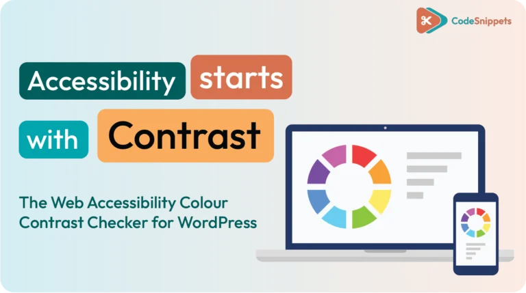
Accessibility isn’t optional – it’s part of building quality, professional websites. The Web Accessibility Colour Contrast Checker for WordPress from Code Snippets Pro gives you a fast, reliable way to test whether your foreground and background colours meet WCAG contrast standards.
With a simple code snippet added to WordPress, you can paste in your colour values and instantly see whether they pass AA and AAA guidelines – plus get recommended hex values when they don’t.
No guesswork. No external tools. Just clean, compliant design decisions.
Why Colour Contrast Matters in Web Design
Colour contrast directly affects readability and usability. If your text doesn’t stand out clearly from the background, users struggle – especially those with visual impairments or low vision.
WCAG AA is the standard most professional websites aim for. AAA is stricter and ideal when accessibility is a top priority. Our checker calculates the exact contrast ratio so you can make objective, standards-based decisions instead of relying on “looks okay.”
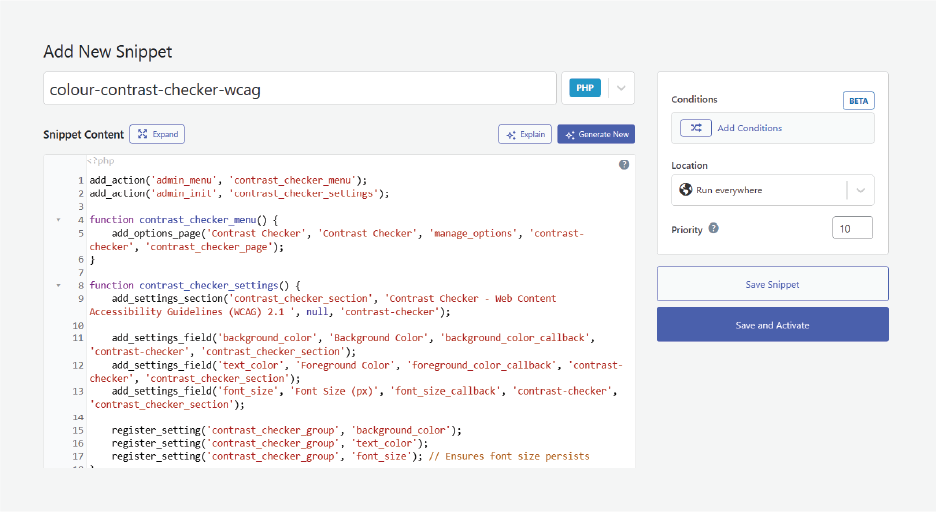
How the Web Accessibility Checker Integrates into WordPress
The tool runs as a lightweight snippet inside WordPress. Once added using a trusted snippets plugin, you’ll see a new Contrast Checker option in your WordPress Settings menu.
It’s always there when you’re working on themes, styles, or custom CSS. As with any snippet, we recommend testing on a staging site or taking a full backup before adding new code.
How to Use the Colour Contrast Checker
Using the checker takes seconds:
- Pick your foreground and background colours using the selector, or paste a hex value (e.g. #FFFFFF, #FFFF00).
- Click Check Contrast.
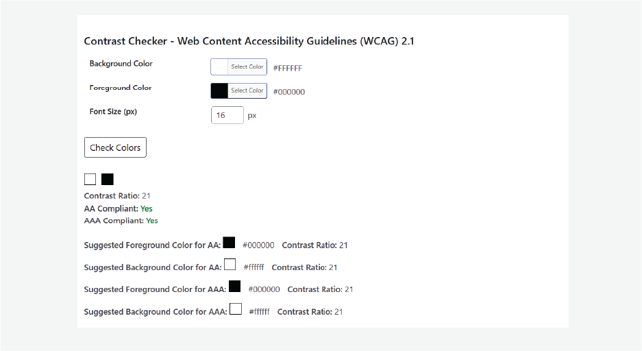
You’ll get:
• Pass/Fail Status for AA and AAA
• Contrast Ratio (numeric and transparent)
• Recommended Shades – the closest compliant hex values you can apply directly in your CSS
• Helpful Notes about font size and weight where contrast perception matters
For example, yellow text on a white background often fails with a ratio around 1.2. The checker will suggest darker, compliant alternatives that still fit your brand palette.
Choosing the Right Compliance Level
Not every site needs AAA across the board. AA gives you strong accessibility while keeping creative flexibility. If your brand colour is close but not quite compliant, the checker shows you exactly how much lighter or darker it needs to be.
Small changes = big usability gains.
Quick Setup Checklist
✔ Back up your site
✔ Add the snippet using a trusted snippets plugin
✔ Test your colour pairs
✔ Apply the recommended hex values when needed
Final Thoughts
Accessibility is part of writing good code – and good design. The Web Accessibility Colour Contrast Checker helps you validate your colour choices, meet WCAG standards, and build sites that are easier to read and easier to use.
Make accessibility part of your workflow, not an afterthought.