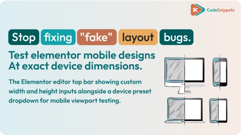
Elementor’s default mobile responsive mode is helpful, but the preview canvas often looks different from a real phone screen. For example, a layout might look squeezed inside the editor. This pushes you to change your spacing, even though the page looks fine on a physical device. Consequently, layout bugs can reach your published site.
You can easily fix this issue by using the Code Snippets plugin. As a result, you can preview your pages at exact mobile widths and heights. When you add custom dimension controls and selectable device presets to the Elementor top bar, you can test your pages at the exact sizes you need to support.
🧩 Why Elementor’s Mobile Preview Differs From Real Phones
Mobile layouts change based on the exact width and height of the screen. Even a small change in screen size can quickly affect your overall design:
Headline Wrapping: Important headings break onto extra lines unexpectedly.
CTA Alignment: Action buttons squeeze together or stack incorrectly.
Vertical Hierarchy: Essential content gets pushed too far down the page.
Image Proportions: Images crowd the screen or leave awkward gaps.
A generic mobile canvas does not reflect the wide variety of modern phones. If you adjust a design to fit a generic preview, you often create new issues. For instance, if you add large gaps to make a narrow editor canvas look comfortable, that section will look empty on a wider phone screen.
⚡ Enable Exact Width and Height Controls in Elementor with Code Snippets
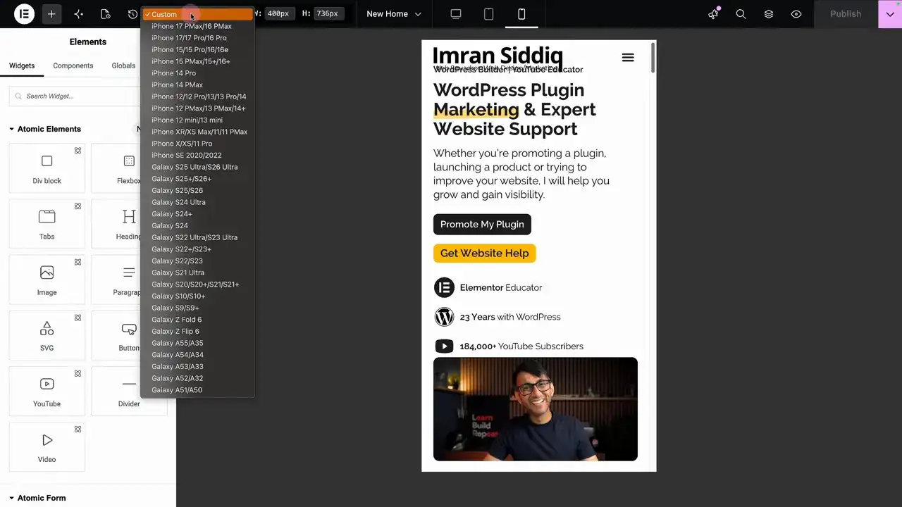
You can upgrade the Elementor responsive top bar by using the Code Snippets plugin. Therefore, this addition gives you exact pixel inputs and a quick device selection menu right inside the editor interface.
Instead of dragging the editor canvas by hand and guessing the resolution, you simply type your target dimensions. In addition, you can pick a specific phone model directly from a custom dropdown list.
🛠️ How to Add Custom Mobile Viewports to Elementor
Setting up this feature in your editor takes just a few minutes. Furthermore, you do not need to write any custom code yourself.
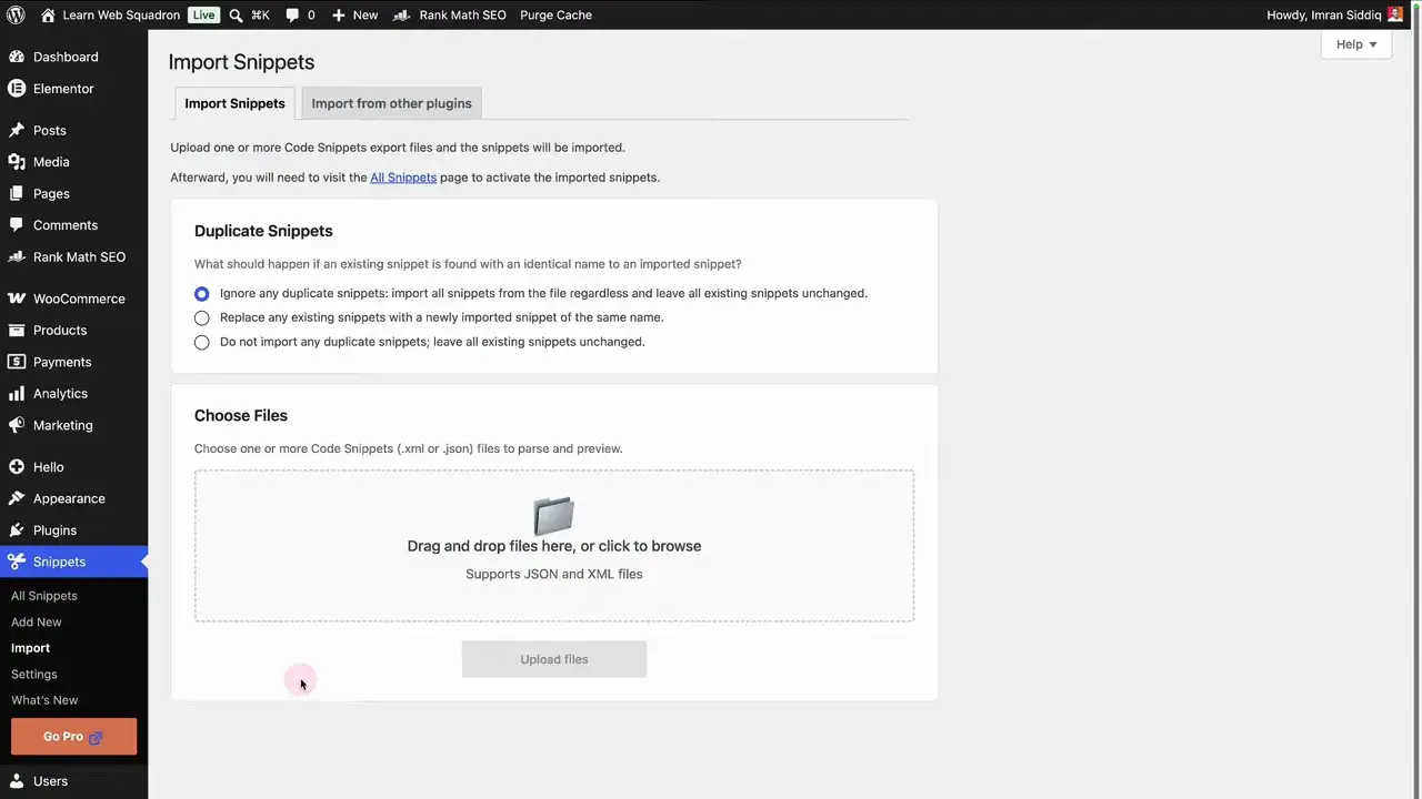
First, get your snippet file ready on your computer. Next, make sure you install and activate the free Code Snippets plugin from the official WordPress plugin directory.
After your plugin is active, open Snippets > Import in your WordPress admin menu. Drag your snippet file directly into the importer window. Give the snippet a clear name like “Elementor Custom Mobile Viewports” so your team can find it later. Finally, click Save Changes and Activate.
Now, open any page in Elementor and switch to Mobile Responsive Mode. As a result, your new width, height, and device preset controls will appear right inside the top toolbar.
Quick Tip: Always import your file through the official Code Snippets dashboard. This ensures that all top-bar controls register properly inside the Elementor editor interface.
📱 Select Mobile Device Presets Instead of Guessing
Manual pixel inputs work well when you test unusual screen sizes. However, device presets make daily editing much faster.
The custom snippet includes accurate viewport resolutions for popular phones:
iPhone X / 11 Pro:
375px x 812pxiPhone 16 Pro:
402px x 874pxiPhone 17 Pro:
402px x 874pxiPhone 17 Pro Max:
440px x 956px
How Presets Improve Your Editing Workflow
When you choose a preset, the Elementor canvas instantly snaps to those exact dimensions. Consequently, this lets you inspect top content, sticky menus, and text sizing in real time.
In addition, testing multiple presets helps you catch layout breaks before pushing your site live. Therefore, using device presets saves you time while building better responsive pages.
🛑 Common Mobile Responsive Preview Mistakes to Avoid
❌ Fixing the Editor Instead of the Layout: If a generic preview looks tight, check the page at an exact viewport width first. Therefore, do not change your margins or padding right away.
❌ Testing Only One Screen Size: A layout that looks great on a large screen might break on a smaller phone. For this reason, always test narrow, medium, and wide screen sizes.
❌ Confusing Width with Height: Viewport width changes text wrapping and column layout. Meanwhile, viewport height controls what the user sees before scrolling. You should set both values carefully.
❌ Overloading the Preset List: You do not need every phone model in your menu. Instead, keep a clean list of 3 to 5 main screen sizes to keep your editing fast.
🏁 Key Takeaway
Accurate mobile previews stop you from wasting time fixing fake layout bugs. When you use the Code Snippets plugin to unlock custom width, height, and preset controls in Elementor, you can build responsive pages that work across all screen sizes.

Huge thanks to Imran Siddiq - Web Squadron for architecting this tutorial!
❓FAQ: Elementor Mobile Viewports & Code Snippets
🧩 Do I need a device preset for every single smartphone on the market?
No! The goal is not to mirror every phone model, but to test key viewport boundaries. A balanced setup containing a narrow phone (~375px), a standard phone (~402px), and a large phone (~440px) will catch virtually every responsive layout bug.
🧪 Does this custom snippet modify the actual front-end layout for site visitors?
Not at all. The code snippet strictly enhances the Elementor editor interface inside the WordPress admin. It outputs zero code or styling scripts on the front end, ensuring your site speed remains 100% unaffected.
🔑 Why does my device's official screen resolution differ from the viewport size in the snippet?
Modern smartphones use high-density Retina or OLED displays with high device pixel ratios (DPR). While a phone might be advertised with a 1179 x 2556 screen resolution, its browser renders web layouts at a logical CSS viewport size (such as 393 x 852). Always use CSS viewport dimensions for your testing presets!