Fluid typography is the secret to a professional site. Instead of fighting with fixed font sizes at every breakpoint, a Font Clamp lets your text resize smoothly. Consequently, you save hours of manual tweaking.
We are moving away from “fixed” thinking. This guide shows you how to use a Font Clamp Calculator that works for both Elementor V3 and V4. 🏛️💎
Grab the Snippet: Your Typography Engine 💎📦
First, you need the engine that powers the math. This snippet is a Free Resource that handles complex clamp() formulas for you. Therefore, you don’t have to be a math expert to get perfect scaling.
- Step 1: Download the Fluid Font Clamp Calculator snippet.
- Step 2: Import it into your Code Snippets dashboard.
Step 3: Activate it and define your scale. 🛡️✨
Why Use a Font Clamp Calculator? 🧠✨
In the “Old Way,” you set font sizes for desktop, tablet, and mobile manually. However, in the New Way, you define the logic once. As a result, the browser does the heavy lifting for you.
Furthermore, this approach offers a more Proportional UI. Buttons, links, and lists scale together perfectly. Additionally, it ensures Consistency, so your “Large” heading stays the same across every page. Finally, it boosts Performance because fewer media queries mean a faster site. 🏎️💨
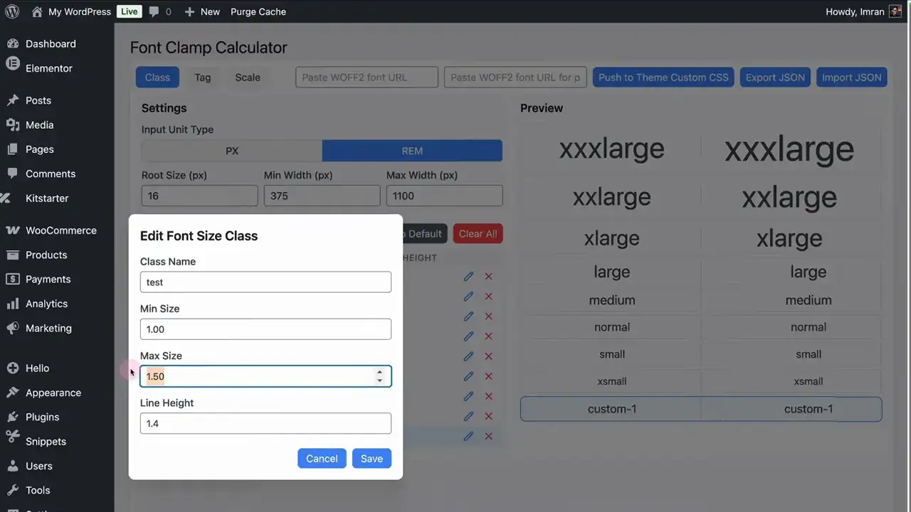
How to Configure Your Scale 🛠️
Once the snippet is active, open the calculator in your WordPress admin. At this point, you can begin defining your design system.
- Set Your Values: Pick your minimum and maximum sizes (pixels or rems).
- Generate Code: The tool creates the CSS logic needed for your site.
- Copy the Output: You’ll need this for the next step.
Because the tool is flexible, you can create multiple scales for different site elements.
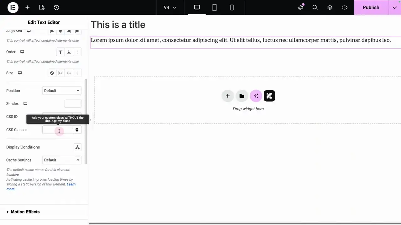
Applying the Logic to Elementor V3 vs V4 🏗️
After generating your code, you must place it where Elementor can use it globally. Specifically, go to Site Settings > Custom CSS and paste your code. 🛡️
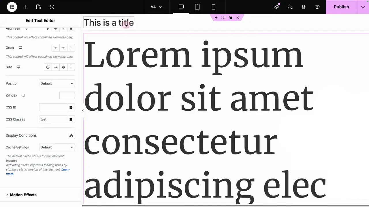
For Elementor V3 Users: Assign your custom class (like .text-xl) in the Advanced tab of any widget. Consequently, the element will adopt the fluid logic immediately. 🎯
For Elementor V4 Users: Because V4 handles classes differently, you might need an extra step. If your class is missing, follow these steps:
- Open the Class Manager.
- Create a new class with the exact name from the generator.
- Apply it to your element. 🛠️✅
Common Troubleshooting Steps ⚠️
While the setup is straightforward, you might run into minor display issues. For instance, the editor UI might look static while you are working. Therefore, you should always check the mobile preview to see the fluid scaling in action. 📱
In addition, pay attention to your units. For better accessibility, we recommend using rem units for your min/max values. Similarly, if you are on V4 and the class doesn’t appear, manually adding it to the Manager is the reliable “pro fix.”

Huge thanks to Imran Siddiq - Web Squadron for architecting this tutorial!
❓FAQ: PDF viewer
Does this approach work for both Elementor V3 and V4?
Yes. The generated CSS is architected to handle both versions. You just need to paste it into the Global Custom CSS in Site Settings.
Can fluid sizing apply to buttons and links?
Absolutely. Unlike standard typography settings, using these classes allows your entire UI – including buttons and lists – to scale proportionally. 💎
Why doesn't the size change in the Elementor Editor?
The editor is often a fixed width. To see the “clamp” in action, use the Responsive Mode toggle or view the live page and resize your browser.
Where is the best place to add the code?
Always add it to Site Settings > Custom CSS. This ensures the logic is loaded across your entire domain, keeping your design system intact. 🛡️✨